
So, after months and months of impatient waiting, we finally got our new kits (uniforms) for my cycling team, Bridgetown Velo!!!! Wahoo, and I'm stoked for soooo many reasons (please, read below).
First of all, a big reason why I joined BTV was because not only were their representative riders at the Meet the Teams ride nice, but I liked their colors and their uniforms. As a graphic designer and an athlete, these things are quite important to me. So, I inquired about joining them, rode with them a few more times and then got accepted onto the team. Not too long afterwards I went to my first team meeting where a representative from Castelli USA (a very well known, innovative, and spendy Italian cycling apparel company who's US headquarters just were relocated to Portland) about joining up with them and getting new kits. As the Castelli rep talked and talked about the variations in garments, padding and fit and most everyone else's eyes glazed over with boredom... my twinkled with excitement and my head started spinning with possibility: Wow! gear! This is really cool. Not only am I going to need a kit to race and look like everyone else on my team, but the whole team is getting new kits!!! What are they gonna look like? Are they gonna keep their current logo (which kinda sucks) or go with a new one?
That evening, after the Rep left, we discussed getting new kits and what would be done about the design. If we would use the current logo or come up with a new one? Being brand new to the team and hardly knowing anyone in the room, I didn't want to step on any toes so I kept my mouth shut. However, it didn't take too long to realize that no one had a clear answer to the situation at hand, so I spoke up. "Hi, i know I'm new to the team, but I'm a graphic designer and logo design is kinda what i do - so, I volunteer my services to the team." So, not too long afterwards, I started emailing our team manager Josh about ideas and requirements from Castelli and got busy designing.
The main thing was creating a new logo. The one they'd be using for several years looked like this:
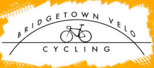
As you can see, not that exciting or appealing.
So, I started sketching, playing mainly with type and came up with ideas, landing on two or three big ones...


Personally, the first one was my favorite and the first one I created, but the team thought it looked a little too much like a basketball (I was going for a bridge over water and bike wheel)... so I tweaked with the design a little and made the circle more of an oval. As well, some folks weren't too cracked about the font on that (personally I loved it though) - so I played around with some variations on a theme. But, came back to that type face over and over and over again. As well, I designed some other bridge/wheel combos and tried to "modernize" the look as well.


When it all came down to it though, we decided on a version of the typeface I liked with the wider spanning bridge and it's various alternative markings and layouts.

The kit design itself is based upon a template that Casetlli created for a team with similar colors from the Mid Atlantic region. With them, we played around with color blocking choices and decided if we'd rather have orange or navy as main color and how much we wanted to incorporate white into the kit. Eventually by the beginning of the year we had reached a design decision and everyone placed their orders.
In the meantime, we were out riding a lot as a team and racing. Pretty much everyone looked the same as each other except for us new Cat 4 women riders who all joined at the same time and had all been given a "hand-me down jersey" from some gracious team member or another. While it worked, it didn't work well and quite often, people would come to us at races and ask what team we were. My jersey was about two versions old and the BTV logo on that kit was pretty much indistinguishable.

As you can see, there are three various jersey designs here and no one has matching shorts or anything cohesive. In fact, at this race (the Cherry Blossom Classic) my teammates and I would change out of our jerseys as soon as the race was over because we just were not happy with how mismatched and scruffy we looked. It's a proven fact that if you look good and feel good, chances are that you're gonna ride a little better too.

final design template
Also, it may be a little known jenn levo factoid here, but as a small child I would create my own major league sports teams. I would design a logo and alternate logos for them, pick their color choices, then create their uniforms and then ultimately make "baseball cards" for them, designing even the layout of the card. So, long story short... being able to design a new logo and help create the kit for my cycling team and have it come into production is pretty much a childhood dream come true. Not only am I stoked because now I can race and ride and look like everyone else on my team, but to have everyone on my team be wearing something that I created that is more labor intensive than a simple logo silk screened on a rec league t-shirt, is pretty fucking cool in my book.
Look for us and our new kits out on the roads and raceways of Portland and throughout the PNW! And if you pass us or get passed by us, don't forget to smile and say... nice kit!

No comments:
Post a Comment