
Showing posts with label graphic design. Show all posts
Showing posts with label graphic design. Show all posts
Wednesday, January 5, 2011
Thursday, November 18, 2010
To Do List: Rewrite and Reride History

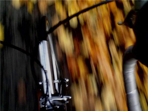
So, last year I wrote a little bit about a new vintage book I picked up online, The Oregon American Guide Series book from the WPA, first published in 1940. Due to the fragile nature of the book, I really haven't fully delved into it's facts, figures, routes, trips and storied past of Oregon history... but whenever my mind wanders into getting outside and exploring more of Oregon... my mind goes back to this book. As I've said before, I'd love to follow some of the routes suggested in the book and then take photos at the same spots pictured in the book; however, I'd do it all on bike. In proper Oregon fashion. The only problem is, for as much as I enjoy riding my bike... I don't really like "riding" my bike. Truth of the matter is, if I'm on my bike it's probably because I'm racing it (and ideally, in spans of time no longer than forty-five minutes at a time). Learning to ride for long distances for long periods of time is something I'll have to get used to. Maybe, thinking of documenting this trip while riding would be a good place to start.
Anyways, I got out the camera last evening and decided to take some more photos of the book... you know, to keep the fires going. If you are a local cyclist who does enjoy riding for long periods of time and would like to sign on with me to explore some of the routes... I'd love to collaborate with you. Let's discuss.


Friday, November 12, 2010
small rant
So... the other day a friend of mine sent me an email and said her company was looking for some new design work to be done and she thought I might be interested. Well, always looking for more freelance work, I followed her link to get more info on the project and came across this site, 99designs. And, suddenly I was revolted. I mean, don't get me wrong... I was happy my friend thought of me and passed along word of work - but I think I as a designer, am going to have to put my foot down and take a stance on things like this.
Basically, what 99designs is a website where companies, who are looking for design work to be done, can basically sponsor a "contest". And any designer or artist with some time to spare can take as much time as they want to... and enter the contest. The company then picks the design they like best and 99designs pays the designer for their work. Overall, it seems simple and great for the company. They never have to actually deal with an artist and they have tons of designs to choose from.... all submitted to them for free! On the designer end though... if they win the "contest" - great they get some cash. If they don't win... well.... they get nothing.
Full disclosure here, yes.... I have done some design "contests" and yes, I have won some of them. Most of them have been from small companies who didn't really know any better or I myself, didn't really know better. Or, maybe I just had some work that I had done prior that never saw the light of day and entering it into a logo contest was an easy way to earn a few bucks (in that case I get the last laugh). But what we have here with sites like 99designs, is a company who is basically "whoring out" designers. It's letting small companies who don't know any better or maybe have no idea how to hire a graphic designer, get cheap labor and spec work. It makes us as designers... seem like we are all starving artists who will gladly toil our time and creativity away for the small chance that we might win a few bucks here and there. It treats that small company as if they were the king of the world and if we, as designers, should feel privileged to do work for free. That we are salivating... waiting for bread crumbs that come in the form of the sheer overwhelming joy of the slight opportunity to design a logo for your wedding invitation.
And the thing is.... yeah, some of us are going to do it. Sadly, times are tough... no one knows this more than creatives, we understand, we feel... and we need to put food on the table as much as everyone else. So yeah, dangle a carrot in front of our face and we might grab for it. At the same time, it is killing our profession. It is killing the value that goes into what we do and coming up with a unique and original design catered to each project. It is removing the humanity from the craft. Shit, you might as well be going out and buying clip art if that's all you expect your work to be like.
I don't know if this kinda crap happens in any other industry?
If I want a custom bike, do I have each custom bike builder spend their time and hard earned money creating the perfect bike for me and then I pick the one I like best and then pay them? No. Would you call ten plumbers over to your house and only pay the one that fixed your leaky pipe the best? No... even though you migth want to. Would you have six different architects create and design a house catered just for you and then you decide to pick and pay the one you like best? No. I mean, yeah... a lot of time designers and companies have to bid for work and make proposals... but they are never actually finished products. Usually those things mean that you'll get the job and then get more work from those clients as you work with them, but here... no, it's slam bam thank you mam and don't let the door hit you on the way out. Oh, and maybe here is an extra $5 for the bus ride home.
As well, as a client buying into 99designs, how do you know that you are getting original creative work suited for you? How do you know that artist didn't just pull it off some clip art page? How do you know it's not something they directly copied from someone else? How do you know that you aren't gonna get sued when someone discovers your logo is the same as theirs?
Take for example, this summer one of Seattle's biggest music festivals "Bumbershoot" created a contest so that designers could create a new logo for the festival. When word got out about this, the design community of Seattle went bat shit crazy? People expect this kinda stuff from small fry companies... but from Bumbershoot? A festival that is supposed to be supporting the arts? So... hackles were raised, letters were written and eventually, Bumbershoot admitted they had no idea that people were passionate about the issue, they were just uninformed and didn't know any better and later canceled the contest.
AIGA, the American Institute of Graphic Arts, has a strong stance against "spec work" and even works hard to inform students, educators, designers, clients, and the general public on the risks of compromising the design process. "AIGA believes that professional designers should be compensated fairly for the value of their work and should negotiate the ownership or use rights of their intellectual and creative property through engagements with their clients."
Basically, I don't want to come across wholier than thou - but I am going to have to start putting my foot down about this and informing some people about this because they just don't know. And when I say "some people" I mean you. You out there reading this. I may know you, I may not know you, but you probably have a skill or a trade that I myself cannot do. I value you. I value your education and the time you put into your job and your work because that is what makes you... you. If I hire or ask you to do something, it's because I intend on paying you for what your services and skills are worth. At the same time, I value myself. I value my skills and my time and what makes my work unique, creative and original. Unless you buy me tons of beer (my keg of ninkasi is starting to run low) or I am a friend helping you out because I respect you, I am not going to whore myself and my talents out. I am putting my foot down and saying no. No more free spec work. No more "contests". No more work under the guise of "good exposure". And... even if I have to work at Subway making sandwiches to put food on the table, at least I can go to bed at night knowing that I didn't comprise myself or my peers. I can look at myself in the mirror and then wipe the mustard off the side of my face and eat another sandwhich (from Subway, you know?)
Wednesday, August 4, 2010
extra time
Sometimes I have these mornings where I don't remember the alarm clock giving me a choice of when exactly I wanted to wake up. In fact, I wake up and I'm already late. I don't remember ever hitting the snooze button fifteen minutes prior and I'm in the middle of a ridiculously crazy dream involving Lindsey Lohan and I'm terrified and amused all at the same time... but, alas... work is calling and another day full of activity is ahead of me. Then I remember I just moved to a new house closer to work and instead of a 20 minute commute to work, it's down to a perfectly manageable 12 minutes. So, I sit there for another minute, giving my mind a chance to gather it's thoughts for the day and then within seconds, I'm already thinking of bike racing and new poster designs.
The bike.
I feel like a broken record quite possibly talking about bikes as much as I do, but it's a constant in my life. I have a new commute and I'm always looking for ways to shave time off of it, looking for ways to stay in bed just a little bit longer, looking for ways to sit perched on the edge of my chair putting my shoes on one by one, the right one first (for good luck) and thinking about random things like colors. In some aspects, I miss my old commute. Twenty minutes is a perfect time to ride and think. Vancouver was a perfect sprint track... one light to the next to the next and to the next. Passing other commuters with their pannier bags and yellow vest, passing the hipster on his fixed gear, passing the random lady who needs to be wearing a helmet but makes up for it by having cool shoes on. One after one after one...all the while, thinking about some random thing, racing through the morning mix of pre-coffee clutter in my mind. But now... I have to think: a shorter commute leaves less time for random thoughts while riding. Eventually yes, it'll become as common and complacent as the last commute, but now my twelve minutes is spent trying to figure out what the shortest and fastest route is.
The past few months have flown by.
The summer is always busy here in the PNW. Week to week it's about bike racing and softball and grill outs at friends houses. Usually there are a few guests and a few camping trips thrown in there for good measure, but I always get a sense of relief when Labor Day rolls around and life seemingly calms down. Add in moving in to a new place with my girlfriend and not feeling settled yet - and my mind is all over the place. So much to do, so much to do. I look forward to the afternoon when the appropriate pictures are all placed on the wall and I can bake some cookies in the oven. But now there are just boxes, boxes full of her stuff, boxes full of my stuff... stuff that I could probably go without. Stuff I could minimalize. But to do that would take time. Physical time that I don't have.
Riding the bike is easy, it allows time for my mind to wonder. I can't tell you how many times while racing or riding, I am thinking about something else completely. My mind is multi-tasking while biking. Work is even easy, I multi-task there too. I steal moments away for day dreams and thoughts about other things. But, physical time... time to sort and move through stuff, that is hard to come by. That's difficult. Like taking two whole days to move boxes and carry things up and down stairs. Two days of negotiating heavy objects in spatial relation to the things around them. Two days of not thinking about random things. Two days of disorder. Two days of physical and mental chaos. But, in the end... that time is worth it. It's worth the few weeks of learning where the forks are, it's worth learning the ins and the outs of a new bike route. It's worth giving up the physical auto-pilot for the end result. The end result knowing that you don't have to think anymore about some things. Somethings, you just know. For example, you know that when you wake from that crazy dream with Lindsey Lohan in it, the one where she is trying to run you off the road because you won't call her back... that when you wake up you can breathe a sigh of relief. This is because you know, that when you hit the snooze button, in spite of everything else that you have to do, everything else that calls for attention in your brain, everything that you just don't have time to do, that you're taking an extra few minutes out of your day to stay in bed for just a little bit longer. You are making an attempt to steal away a extra few minutes here and there so that you can spend some time sleeping next to someone you love.
Friday, January 22, 2010
RE: my beef with the outdoor industry... aside from Rapha that is.
In response to my post from earlier this week regarding the outdoor and sporting goods industry and their seemingly overwhelming desire to make things catered towards women by making them pink and curvy... I can safely say there is a breath of fresh air on the horizon.


As you may recall, I had mentioned that Rapha, the men's cycling clothing line, was gearing up to release a new line of women's clothing later this spring and I was curious to see if they would stick with their same classic and suave designs and colors that they make for men.... or would they throw in a lot of pastels and butterflies in an attempt appeal to women in the same ways that it seems most other companies do? Well, apparently Slate Olson, General Manager of Rapha (USA), happened upon the post and in response, was kind enough to share with me some photos straight from their recent shoot in italy of the new women's line. And what from what I see.... I'm very very pleased.
(thanks... Slate for the first look!)


As you can happily see, Rapha went with their same classic approach to cycling apparel: a form fitting feminine cut with strong bold classic colors and touches of pink here and there. And... while you may think I initially cringed at the pink inclusion after my last tirade...the cool thing about their usage of pink is that its actually a fairly prominent accent color for them (not only in their menswear, but their website design and graphic elements that they use overall). Much like Bianchi's celeste blue bikes, it's a signature flair aimed at the initial target market (men) and not as something to make women like the item more (I love it!). Rapha also plans on introducing a mens Stowaway Jacket later this year... totally in pink. Granted, while they hope a few women might be interested as well.... their main focus is the dudes.
Thank you for sharing Slate and thank you Rapha for recognizing the athletic women out there who want the same cool stuff as the dudes... but we want it to fit us. Thanks!
Now... i just need to save my money to get some cool stuff. :)
Wednesday, January 20, 2010
My beef with the outdoor apparel and gear industry:
My beef with the outdoor apparel and gear industry:
stop making women's things pink.
....and while you're at it, stop making them soft, flowy, flowery, paisley, rounded, anything really that you think makes stuff "appeal to women". Cause really, honestly, I am a woman and I am a woman who spends a fair amount of my money on gear for athletic pursuits and I hate pink. In fact, I and my friends will run away from anything geared and marketed towards women that are "catered" to us as such. I do not expect you to "cater" to the tastes of women by making things pink with flowers no more than I expect you to cater to men by making things black that have skulls and cross bones. All that stuff, is bullshit.
In some aspects, I applaud you for the good marketing sense to know that yes... some people will buy into that. Some girl somewhere dreams of being a ballerina, living in a Barbie Dream House, and wants a bike. A pink bike. A pink bike with white wheels and a basket on the front. Just like some boy out there thinks that having a bike with big burly wheels with dragons or ninja's and tattoo like tribal designs will make him more manly and less likely to be beat up at school. I applaud you for knowing that you can make money off of it. But really, I'm sick of it.
While for the longest time I used to think that when companies made gear for women, they pretty much shrunk it and colored it pink (aka: shrink it and pink it!). And, for most companies this was and still is the case. But, some companies have evolved since then and have matched the technology they give "men's gear" to "women's gear"... but ideally, there should not be a difference in what is considered mens or womens when it comes to coloring (or cost for that matter too). I do recognize that a woman's fit and sizing is different than a man's. I like how some companies... due to the recent trend in men's clothing being massive and huge... are making things more slim and trim for women, but overall... stop it with the pink and the fuisha and the flowers. And the bling? WTF is this shiny thing doing on my sunglasses?
Basically, I want the cut and fit of my items to be catered to my body and the special needs of women. However, the colors and the style and design? Just go with strong, bold, and basic colors. Don't follow the "trends". I want this coat that I payed dearly for to look just as good and as timely and classic in five years as it did the day I bought it. Give women's gear the same respect you'd give men's gear. Size it appropriately, but treat it with a sense of style that crosses "supposed" gender boundaries.
Take for example, snowboard designs.
Recently REI had a contest sponsored by Arbor. Formerly, I had pretty much liked Arbor boards as the superficial design of them wasn't really gender specific. They tended to incorporate a basic wood grain aesthetic that appealed to women as much as men. I was curious with the contest though, if the majority of the entries would reflect the current horrendous trends in snowboard designs, or if we would be witness to stuff that was really new, exciting, and perhaps....gender neutral? As well, based upon the entries.... would Arbor chose something that dared to be different or would they cater to the unoriginal trends, thereby repeating the cycle?
And the winner is.... a disappointment.

Granted, the hummingbird work in ca-junction with the wood grain is pretty cool... but the hot pink magenta bottom decking? WTF?
The designer said:
"This board was conceived for the main purpose of speaking to Arbor snowboard's female demographic. The bottom design was inspired by elements in nature like the clouds, wind and snow. In order to reference Arbors discipline in sustainable design I utilized natural root-like swirls emanating from the logo and a cloud-like textures in the background. The top of the board was meant to embody a similar type of beauty in nature but to contrast it by illustrating it in a much more grungy, industrialized urban expression."
I'd like to point out several key words here: clouds, swirls, beauty, grungy, industrialized urban expression? (WTF is that?... I'm sure the meatpacking district has art shows every month to express their grungy-ness in their proper urban environment!) Mainly, my main beef is that the designer wanted to speak to Arbor Snowboard's female demographic... and he did so by making it PINK! It's not that I'm bitter that I didn't win the contest or anything... I knew that after I saw what boards were getting votes (tattoos, scrolls, butterflies, skulls, dragons, flames, eye-roll eye-roll, etc) that the general public who prefers those cliched designs that are repeatedly shoved down their throat, were getting exactly what the industry thinks they want, the board that I designed for the contest doesn't fit those permitters. And honestly... that's fine with me.
This is why, when my snowboard was stolen from me in November, I was most upset (not at losing my board... the first board I had seen after months of looking that I had really liked) but upset at having to navigate the snowboard design world, yet once again, in vein attempts at looking for something that spoke to me and my picky design leanings as much as the last one had. This is also why, I got the same board from the same designer that I had prior (as seen below). It was easier that way.

Another example is bikes.
Ugh... once again last year I was faced with the daunting task of finding a new bike... and if you thought choosing a snowboard was hard, I use a bike waaaay more than a snowboard so basically how it looked and how it spoke to me was ten times more challenging than finding a snowboard I like. Once again, much like with a snowboard, I'd enter a bike shop looking at women specific frames hoping I'd find something that I liked... but more often than not I was disappointed. I feel like bike companies have come a long way in introducing more women specific frames... but, when it comes to the stylization of them, it feels like they are one step ahead of putting a basket on the front. Take for example Obrea, a popular company that makes top of the line racing bikes and recently introduced a "women's line" of bikes. To their credit, they did offer one or two "race bikes" in a basic white and black... but the majority of their other bikes (esp ones that bike stores stocked) came in splashes of pink and light blue. How cute? Really....?

This one, the Onix Dama T105 apparently "brings women-specific fit to a new high on an entry-level monocoque carbon frame, and distinctive style and performance to the female cycling market." Wow, did you hear that? A female cycling market? Well, when did they ask us? Did I miss a meeting or a survey or something? And... if you read further in the description, you'll notice the bike even has a butterfly themed saddle! Wow, that even makes it more adorable. Obrea goes on to mention that "through the European design and functional through the women-specific Dama geometry, this bike brings advanced technology and all-around performance to the more sophisticated female rider who may be new to the sport." Which tells me that they think anyone who may be new to the sport of bike racing, will be less aggressive and thereby will be attracted to the light blue coloring of this bike than a red or black one. And... it has a butterfly saddle!
The bike I ended up getting (as seen below) attracted me not because of pastel colors and saddles with butterflies and script writing, but because I was attracted to the strong basic colors and helvetica type face. Granted, if anyone is known for their pastel colors on bikes it's Bianchi, but for them... almost all of their bikes are their famed color of pastel celeste blue (which means even the men's bikes - aside from mine that is, which is rather ironic when you think about it). I applaud Bianchi for their reverse sociology in color themes as I applaud any man who rides one and is not afraid to appear less masculine.

Also, things I've been in the market for was a new snowboard coat and outerware.
I knew I wanted a red coat and I had a basic style in mind. Mainly, as opposed to most popular snowboarding coats these days, I didn't want anything too big and baggy. I wanted it to be a pretty slim and flattering fit. I didn't want tons of pockets and nor did I want any "bling". This task took about a year and was harder than expected. While several companies had red coats, many of these coats were filled with faux fur trim, gold buttons or unnecessarily huge pockets. The coats I found that were rather plain when it came to "flair" were all men's coats and even a mens small was way too huge to ever be effective on the mountain. Thankfully, that's where companies like Orage excel. Not only does Orage, a Canadian company, offer a wide variety of coats for men and women, they also come in a variety of attractive and fresh (and also basic) colors, and they offer a variety of cuts based upon your chosen style of riding and fit. I decided on purchasing one of their coats that came in perfect color of red and had also the perfect slim and minimalist fit without all of that crap companies like to throw on.

At Orage, you can shop for coats based upon the fit...
Another company I applaud for their slim fitting and functional outerwear is Nau. Based out of Portland, not only is Nau clothing environmentally friendly, but they have a pretty consistent basic color palette across their clothes for each season. The women's colors are all pretty basic and range from a clean cream to a gunmetal grey and back to a subdued purple. Strong, basic, simple, and classy. Year after year and season after season.

classic...
It'll be interesting to see what the cycling company known for "the finest in cycling clothing and accessories in the world" Rapha, plans to unleash for their upcoming women's line of clothing. Currently, Rapha is nothing but expensive class and sophisticated style going on with their lines of "gentlemen's" apparel such as jerseys, coats, and shorts in basic and colors and styles (including tweeds!). I've long awaited to see if they would indeed join in with the ladies apparel industry and how they plan on doing so? Will they size down their classic stowaway coats to women's sizes and cuts and offer them in the same color schemes and fabrics as the mens? Or, will they introduce new items in new flashy colors to try and appeal to the "female cycling market" that according to other companies... likes the color pink.

I'd like to see this in a women's please....
As you may have noticed, I can talk or write about this topic at great length. In fact, I recently had the opportunity to discuss my feelings on sportswear - specifically women's sportswear - with some designers at Mountain Hardware. While it was fun to sit back, drink beer eat pizza and talk coats and gloves with a panel of women and designers, it became apparent that women do look for different things in their sportswear. However, hands down person after person said that if they spend a lot of money on an item and expect to wear it year after year and season after season... they want to go with a more tried and true color and style that they will not get tired of. And... for all of us... pastels, swirls, butterflies do not fit that label. Sitting there in the Mountain Hardware sample room, surrounded by coats for their upcoming fall 2010 collection... I looked at the wall of women's coats and became extremely disappointed in the colors they chose for their new lines. My eyes glazed over at the bright teal, fuschia, and magenta, with overly ornate detailed decorative stitching. Instead, my eyes shifted at the men's line which had bright and solid blues, action oranges and reds, vivid greens... things that drew my attention in and warranted closer inspection. Granted, to Mountain Hardware's credit, in each line they do offer most coats and apparel in a basic black for those of us who tend to cringe at teal. But really, how many black coats do I need in my closet?
Basically outdoor industry, stop making women's things pink or putting text in script just cause you think we like things soft and girly (as well, don't make things in pink and try to tell us it's for "Breast Cancer Awareness" to try and sell more things). Give us the same time and consideration you'd give the men and the same strong, active and bold colors. I'm not asking for things to be separate and equal, I'm just asking for things to be equal. As well, don't downgrade our athletic ventures, goals, capabilities, or worry about "scaring" us or being too aggressive. Be more fluid in your design sensibilities and cross more boundaries than gender stereotyping. And... while it may seem easier than faulting on a color choice, we do get a little tried of black.
Tuesday, January 12, 2010
2010... things to do.
So, this is my year end assessment of 2009 and my things to do in 2010 note. Like I always say, I have never been one for New Years resolutions. I always tended to make my goals at the beginning of an upcoming school year; but alas.... I am no longer 21 and I find for most adults, me included, live revolves from January to January as opposed to August to June, three months of holiday and then back to August again. So... here goes.
2009 Yearly Assessment* of goals and realizations and probable outcomes:
1- find a dentist and go
(check... now, I just have to work on the whole flossing everyday thing.)
2- find a personal dr. and go
2- find a personal dr. and go
(check... several times, it doesn't hurt that she's cute)
3- put money into a travel fund for chile/argentina
(check...I did do this, but right now that money seems to be funneled into traveling to Sweden this summer as well as new bike and new snowboard funds.)3- put money into a travel fund for chile/argentina
4- eat more meals at home
(I actually did do a slightly better job of this than I was doing half-way through the year. For this, I commend my girlfriend and her excellent cooking, our general lack of funds, and the idea that we would rather sleep in on a saturday and sunday morning and eat pancakes in our pj's than get dressed up and go stand in line to have brunch.)
5- spend more quality time with anna, my dog
5- spend more quality time with anna, my dog
(This year, Anna went sooo many places with me. We went camping all summer long and I've learned that she is a great dog to have around by the campfire (most of the time) and at the park because she is obsessed with me and will go everywhere I go. We've had great opportunities to bond this year.)
6- call my mom more often
6- call my mom more often
(ummm.... could be better. This will go on the 2010 list of things.)
7- hug more
7- hug more
(check :)
8- let some things go
8- let some things go
(check :)
9- have a good first season in bike racing
9- have a good first season in bike racing
(see related post)
10- be a good and safe bike commuter
10- be a good and safe bike commuter
(sorry about the cussing thing) :|
11- be more focused at work
11- be more focused at work
(where do you think I wrote this? Just kidding!)
12- don't be late for spin class
12- don't be late for spin class
(I was doing much better at this, but then my spin class hit a mid-summer slack and it got cancelled. No worries though, within a few months I was working at a new gym with new members who are ten times more enthusiastic about class than my former folks. It doesn't hurt that classes these days aren't at 5:30am like they used to be, which also makes it easier for me to not be late!)
13- read more
13- read more
(I kinda sucked at this this year. It makes my 2010 list as well.
14- knock off Mt. Hood (or some other glaciated peak) this year
14- knock off Mt. Hood (or some other glaciated peak) this year
(On Memorial Day I climbed South Sister. Check! However, this still needs to be on my 2010 list.)
15- floss more, always always floss more
15- floss more, always always floss more
(see goal number one)
16- use less single use plastics
16- use less single use plastics
(check. I was very pleased with my limited consumption of plastic and remembering to bring grocery bags with me when I go to the store. Regardless, plastics in our environment is still a massive issue and I will continue with this campaign through 2010 as well.
17-sketch and doodle more
17-sketch and doodle more
Actually, I didn't do so bad at doing this.... but, much like flossing and reading, it can always be improved upon in 2010.
2010 Goals for the future:
1- floss more, always always floss more
(see last year)
2- knock off credit card debit
(i've actually been working on this for the past three years and I'm happy to say that the majority of my debit that I accrued in college in the years after, is almost paid completely off. I've been so much better since 2006 about not using my credit cards (unless I'm buying airfare)... and after that gets completed, I can use that money to finishing paying my dad for the Levoru.)
3- call my mom (and my brother) more often
4- call my friends who live far far away and are never on facebook more often
(i have a tendency to only communicate via facebook)
5- put money into a travel fund for chile/argentina as well as sweden
(basically, save more money)
6- eat more fruits and vegetables
(one cannot survive and be strong on beer alone)
7- spend more quality time with anna, my dog
(I can never do too much of this)
8- more date nights
(who doesn't like to get dolled up every once and while and spend QT (quality time) with someone they love?)
9- be more focused at work
10- sketch and doodle more
11- read more
12- keep spin class fresh and exciting
13- knock off Mt. Hood (or some other glaciated peak like Adams) this year
14- use less single use plastics
15- pay it forward
(I was overwhelmed by the response I had from my friends regarding my stolen snowboard. As a result the best way to repay kindness someone has showed you, is to show and share with someone else that kindness.)
16- work hard at being a better biker
(no longer am I concerned about having faster 2k erg time like I did in college, but I can still be just as competitive and OCD as I was then- but this time when it comes to bike racing. I'm gonna be a CAT 3 soon and I really want to do well at the crits's as well as hammer it down at the track. Read a full report here.)
17- get my website done!!!
(and do a better job of having a quick turn a round time for freelance clients)
18- do the dishes more frequently
19- download less free music that you're never going to listen to more than once
20- hug more, smile more, make more people laugh, make the world a better place
Friday, November 20, 2009
it's not that i'm picky or anything
I've gotta say, while I'm not a huge Ohio State fan at all, I'm kinda looking forward to this Saturday's game when they take on arch rival Michigan. It's not because I hate Michigan, no... I have a special kinship with the state as much as I do Ohio, it's that "Hey, look at us. We're stuck in the midwest" kind of kinship that neighboring Midwestern states share. No, I'm looking forward to the game because Ohio State is going to unleash a throwback jersey that Nike designed to commemorate the 1954 National Champion Buckeyes.


While I do I love a good uniform redesign (University of Oregon - who had 384 uniform combinations two years ago - withstanding), I love the unchanged classiness that some college teams sport. Some people would say that the classic Penn State navy and white just shows the lack of creativity but to you I show you the classic navy and white pinstripes of the New York Yankees. If you're good, you're good and you don't need gimmicky uniforms to bring people in and sell merch. This classic-ness applies to other college football strongholds such as, Ohio State, yes... Michigan, and the other midwestern powerhouse called Notre Dame.
It's kinda interesting to see how a company like Nike goes in and approaches schools based upon their uniforms, history, and willingness to change looks, styles or fabrics and what that means to recruiting and alumni and money coming in and out of the university. It really is quite a science. Actually, the internet is filled with different blogs and magazine's all sporting their own opinions on what schools have made the best and worst dressed list (Oregon is always on the top of the worst list). This year in fact, several teams have gone in and tweaked some uniform items that didn't really need tweaking. Take for example:
The University of North Carolina went for an all-blueberry look
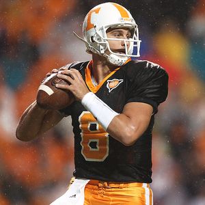
Tennessee added a black jersey
University of Georgia unleashed some black pants and helmets which didn't help them against the Gators.
And well, it seems as if Oregon has a different kit each week.
I think it's interesting how any school.... regardless of their initial athletic color combo will willy nilly seemingly add black to their uniforms. Maybe it's cause black is always the new black and petty much will go with anything, but sometimes it kinda pisses me off. No other color, well... aside from white, gets as much field time. I remember back in high school when I first noticed this trend (think those old school all black Starter jackets with the team logo stitched in the back), every major team had a coat... regardless of their teams colors, the coat was black. Think the Chicago Bears. Nowhere is black in their color scheme, but... they had a black Starter jacket. Anyways, noticing this, I tried to introduce black as an accent color to my Hillsboro High School soccer jerseys (my mom was a coach and pretty much all years aside from my senior year, I picked the uniforms and their design and we looked goooood. In 1997 we got a new head coach and he figured his fashion skills were better than mine. As a result, we ended up wearing what appeared to be trash bag sized uniforms with sleeves down to our forearm. I hated it.) Anyways, I tried to introduce black but it was met with fierce resistance from the Athletic Director and I was vetoed. However, some years later when I was back at HHS coaching softball, I noticed that all of our men's baseball teams are using black as an accent -very similar to the nearby Cincinnati Reds, another formerly all red and white team that randomly added black. (I know for a while during the Cold War they added in navy blue and black as an accent, but... lets just move on from that moment.) In protest, I have vowed to not buy any Reds gear till they go back to all red and white and it's not a throwback day. Classic, timeless.
Our kits my freshman year of high school, they were a year or two old at this point and I had picked them out for the team as a sixth grader - shhhhhh! I wasn't a huge fan of the massive full front imprint, but hey... I was only a 6th grader.
We wore these my sophomore through junior years. These were my favorite. Some people were not fans of the fleecy lining the uniforms had as they got pretty sweaty (I think these were designed for usage in the PNW)... but I loved the over all classic look and feel. Plus, we had moved from umbro to adidas which I thought was a step in the right direction. I also designed the game day black shirts. I didn't include a photo of the kits my senior year because as I said... they were pretty much the ugliest things ever and I erased them from all photographic history of me. They are pretty much on the same wavelength as these awful uniforms from the Reds.
Please, lets go back to when the Reds did things right. Can we?
Subscribe to:
Posts (Atom)
