


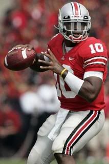
While I do I love a good uniform redesign (University of Oregon - who had 384 uniform combinations two years ago - withstanding), I love the unchanged classiness that some college teams sport. Some people would say that the classic Penn State navy and white just shows the lack of creativity but to you I show you the classic navy and white pinstripes of the New York Yankees. If you're good, you're good and you don't need gimmicky uniforms to bring people in and sell merch. This classic-ness applies to other college football strongholds such as, Ohio State, yes... Michigan, and the other midwestern powerhouse called Notre Dame.


It's kinda interesting to see how a company like Nike goes in and approaches schools based upon their uniforms, history, and willingness to change looks, styles or fabrics and what that means to recruiting and alumni and money coming in and out of the university. It really is quite a science. Actually, the internet is filled with different blogs and magazine's all sporting their own opinions on what schools have made the best and worst dressed list (Oregon is always on the top of the worst list). This year in fact, several teams have gone in and tweaked some uniform items that didn't really need tweaking. Take for example:
The University of North Carolina went for an all-blueberry look
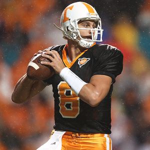
Tennessee added a black jersey
University of Georgia unleashed some black pants and helmets which didn't help them against the Gators.

And well, it seems as if Oregon has a different kit each week.

I think it's interesting how any school.... regardless of their initial athletic color combo will willy nilly seemingly add black to their uniforms. Maybe it's cause black is always the new black and petty much will go with anything, but sometimes it kinda pisses me off. No other color, well... aside from white, gets as much field time. I remember back in high school when I first noticed this trend (think those old school all black Starter jackets with the team logo stitched in the back), every major team had a coat... regardless of their teams colors, the coat was black. Think the Chicago Bears. Nowhere is black in their color scheme, but... they had a black Starter jacket. Anyways, noticing this, I tried to introduce black as an accent color to my Hillsboro High School soccer jerseys (my mom was a coach and pretty much all years aside from my senior year, I picked the uniforms and their design and we looked goooood. In 1997 we got a new head coach and he figured his fashion skills were better than mine. As a result, we ended up wearing what appeared to be trash bag sized uniforms with sleeves down to our forearm. I hated it.) Anyways, I tried to introduce black but it was met with fierce resistance from the Athletic Director and I was vetoed. However, some years later when I was back at HHS coaching softball, I noticed that all of our men's baseball teams are using black as an accent -very similar to the nearby Cincinnati Reds, another formerly all red and white team that randomly added black. (I know for a while during the Cold War they added in navy blue and black as an accent, but... lets just move on from that moment.) In protest, I have vowed to not buy any Reds gear till they go back to all red and white and it's not a throwback day. Classic, timeless.

Our kits my freshman year of high school, they were a year or two old at this point and I had picked them out for the team as a sixth grader - shhhhhh! I wasn't a huge fan of the massive full front imprint, but hey... I was only a 6th grader.

We wore these my sophomore through junior years. These were my favorite. Some people were not fans of the fleecy lining the uniforms had as they got pretty sweaty (I think these were designed for usage in the PNW)... but I loved the over all classic look and feel. Plus, we had moved from umbro to adidas which I thought was a step in the right direction. I also designed the game day black shirts. I didn't include a photo of the kits my senior year because as I said... they were pretty much the ugliest things ever and I erased them from all photographic history of me. They are pretty much on the same wavelength as these awful uniforms from the Reds.

Please, lets go back to when the Reds did things right. Can we?


No comments:
Post a Comment