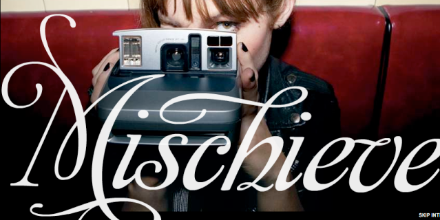
Last evening as I was riding my bike home from work... i stopped at an intersection on Burnside and waited for the light to change. While standing there admist the rush hour traffic, my eyes wandered up to a billboard on the other side of the intersection. I'd seen these ads before, for some type of tequila named Hornitos, at various places over town, and even though I'm not a big liqour drinker - the ads have always struck me. I'm not quite sure if it was the photography or the models they chose for the ads (think more urban and edgy women. Arty and punky with tattoos as opposed to "pretty white suburban sorority girls or Vegas hookers"). Regardless, something drew me to these ads and made them stand out. So, I sat there and contemplated...
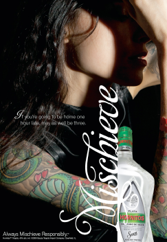
And then it struck me.... it wasn't so much about the models, the photography or the brand that drew me to these ads, .... it was the typography (I am a graphic designer after all). The word "Mischieve" written in a nice decorative swash induced script appealed to me because it just happened to be the very same typeface I had chosen for my own recent tattoo. So I stood there... glancing from the billboard to my inner arm, from my inner arm to the billboard checking the type, looking at the e, i, and v while a huge grin spread across my face. I am such a dork and I love it.
Anyways, to celebrate popular decorative typefaces and spotting them in usage aside from your own, I give you the story of my most recent tattoo, written back in March. As well, if you're interested in the Hornitos ad campaign and their target demo, you can read about that here.
"So, recently I've made some off handed comments about spending more time than normal looking and fonts and perhaps asking around about decent places to get ink done in th Portland area. And well, after the idea sitting on my brain for a few months, the urge finally took over and so Wednesday evening I went over to Blackbird Tattoo Studio on Killingsworth (where I didn't have to pay a deposit nor did I have to reserve a time slot weeks in advance, :) and got some new ink. Like every permeant marking one chooses to get on their body, you should take great care and consideration to figure what you want and where you want it. I already have two tattoos hidden away and hardly noticeable on my left ankle and honestly, I've been josin for something a little bit more "out there", yet... at the same time still reserved. As a result, I chose in the inside of my right arm.
Now, I knew what I wanted and where I wanted, but personally, being a graphic designer and all - type style matters deeply to me. So, I spent a lot of time on one of my favorite type sites, veer.com, and found a font named Affair that I absolutely fell in love with. Now mind you, by no means am I really a "scripty font" type person, but I loved how this type style was simple, yet elegant, decorative but so easily read and lendable. The swashes and ligatures themselves are practically art without ever having to spell anything to start with.
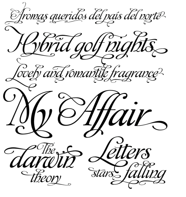
The type was designed by Alejandro Paul, who teaches graphic design and typography at the Universidad de Buenos Aires. He has worked as an art director in prestigious Argentina-based studios, handling high-profile corporate brands such as Arcor, Marta Harff, Morph, SC Johnson, Danone, and Movicom. He has walked away with awards from several design competitions and is also a typeface designer for T26. He is one of the founders of the Sudtipos project, the first Argentinean type foundry collective. Alejandro describes Affair as being "a party full of swash characters, ligatures, and ornaments. By default, it’s simply an elegant yet readable display face. Dress it up with alternates, and it becomes irresistibly attractive, in styles from glamourous to over-the-top. Hundreds of alternates, tons of swashy endings and ligatures."
To me, "affair" accurately visualized the feeling, and emotion I wanted to portray with my chosen tattoo word. Even though I'm an illustrative designer, I like how anyone can add their own imagery to a word. Text alone, leaves your tattoo open for interpretation and lets the viewer, bring their own experiences to mind.
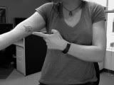
So, without further fan fare.... I present to you my tattoo:
so I hear you got a new tattoo?


Ahh... I see!
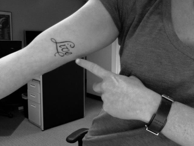
Personally, I chose the location as somewhere I would see it as I am engaged in activity. The word 'Live" itself is pretty self explanatory. I'm a big fan of the phrase "carpe diem" and that's how I chose to see and live my life, but... I feel as if getting "carpe diem" as a tattoo is a little too cliched - and well, I don't really know latin as a language. So basically, it'd be like getting chinese characters inked on me when I don't know Chinese nor am I Chinese. All in all, it's just not me. And, as far the tattoo placement goes, just like symbolism, I'm not really trying to mystify anyone... there are no hidden meanings. I want the viewer to be able to walk away with a heightened sense of positive energy as much as I do from looking at the tattoo. But yeah, basically it's about living your life, seizing the day and doing what you want with the unknown alloted time you have on this earth. Don't hold back. Love like you've never been hurt and dance like no one is watching. Don't regret anything that made you smile. If you're gonna eat a cookie, eat a big fucking cookie. Have your cake and eat it too. Don't put off for tomorrow what you can do today. Make hay while the sunshines. When it pours, jump in the puddles. When it snows make a snowman. Then when it freezes, go ice skating! Remember, you will never be here again. And, as my hebrew friends would say... "L'Chaim".... "to life!" Make it happen folks... live!" -March 27th, 2009
NOTE: Speaking of Alejandro Paul’s typefaces, his new one called Adios, just popped in my email box this morning. Described as an ornate and artful balance between classic calligraphy and contemporary tattoo art, the type face Adios lends itself to creativity. With over 1,470 characters, it's ornate swashes, ascenders and descenders allows a beautiful interplay of strokes and combinations, while avoiding overlaps or conflicts.


No comments:
Post a Comment